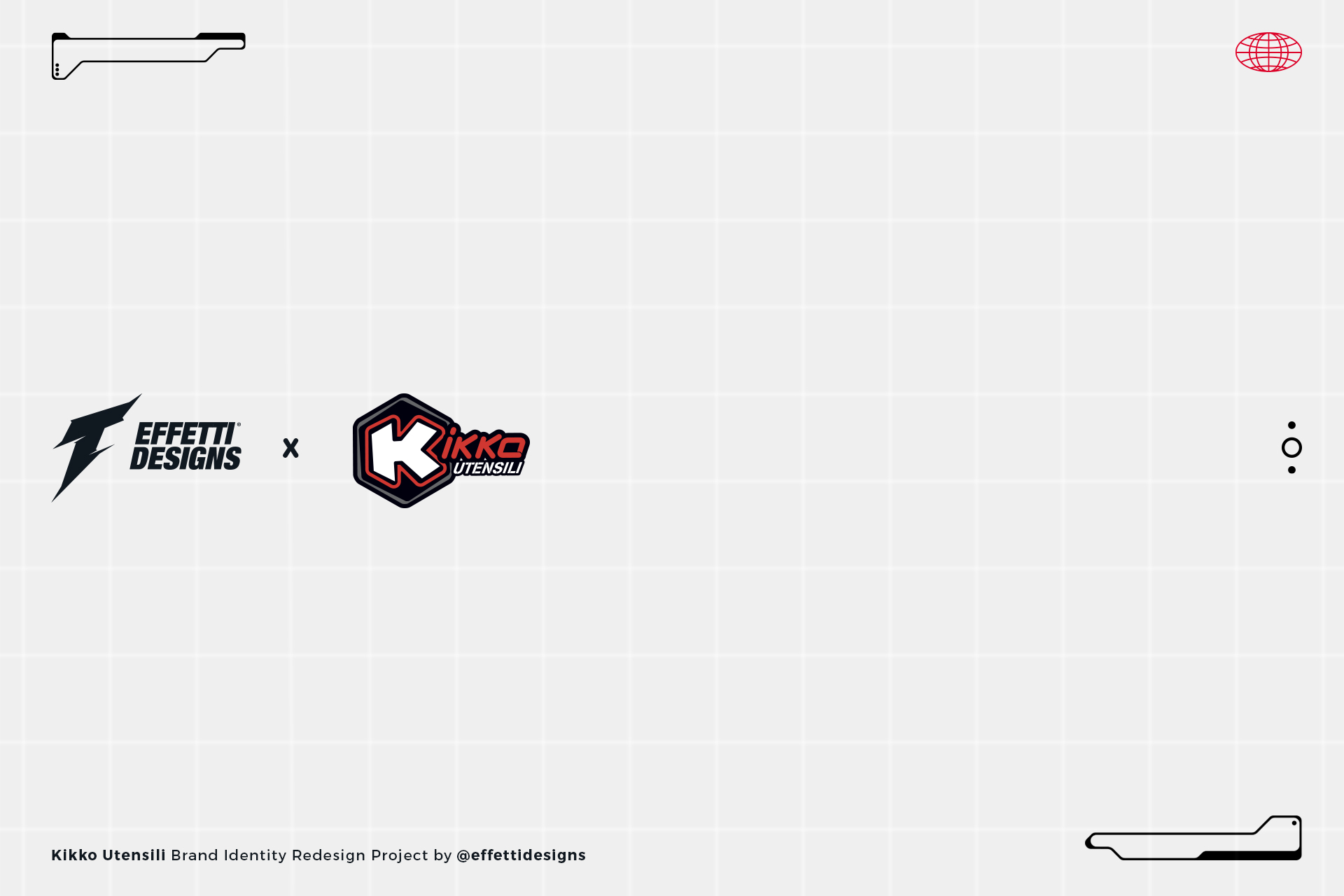
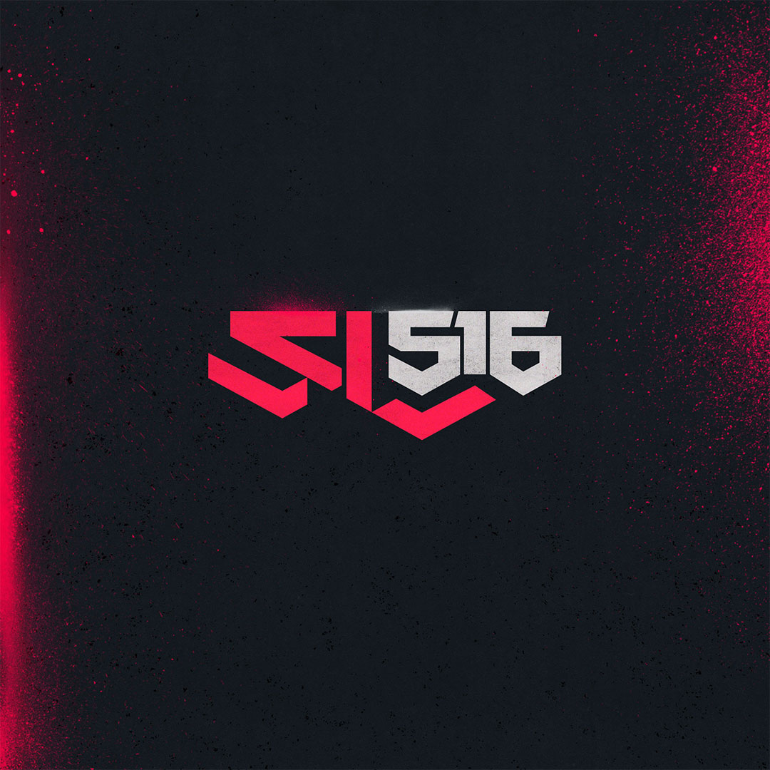
The letter K, the tools in an hexagon and the concept of the Biker in the workshop, motto of the Italian brand.
- Rebranding
- Logo Design
Client
- Kikko Utensili
Year
2022
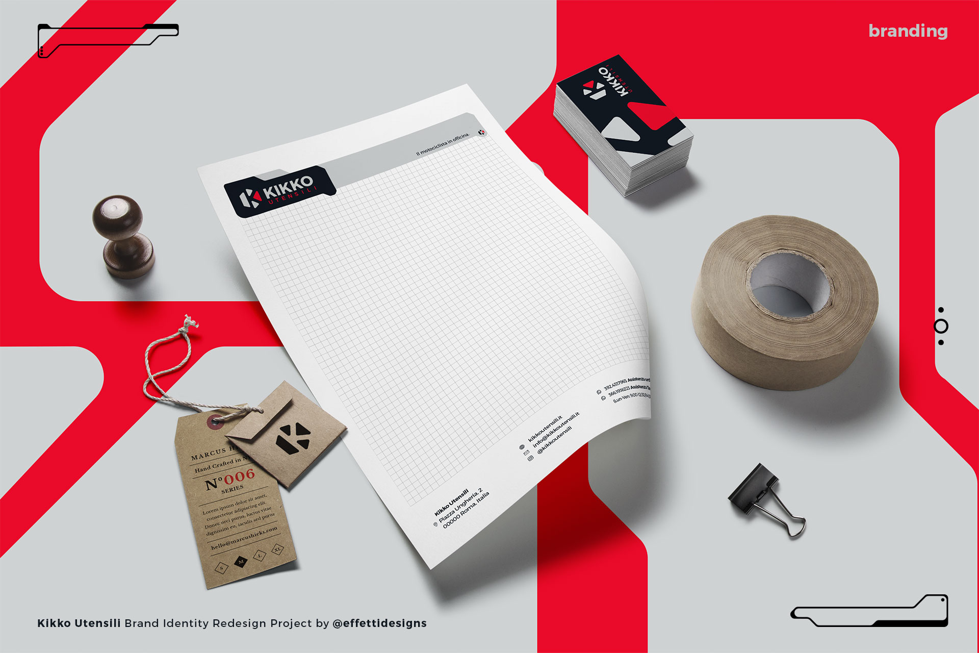
When the guys from Kikko Utensili contacted us for a rebranding, we immediately thought that we needed to simplify and approach the project with minimalism, at least on the main logo.
We’ve been able to represent the letter K, the theme of tools in a hexagon (also referring the previous logo) and above all the concept of the biker in the workshop, motto of the Italian brand.
The branding applications are aimed at a young audience, who love racing and who spend a lot of time in with their passion, motorsports.
This led us to use metal gray colors and racing red, contrasted with a very clean and legible typography, aimed at marking the extreme precision and reliability of Kikko Utensili products.


